Elementor mobile editing is becoming increasingly crucial in the digital age, where mobile browsing has overtaken desktop. This shift necessitates a dedicated focus on mobile optimization to ensure websites are accessible, functional, and aesthetically pleasing on smaller screens. Elementor, a popular WordPress page builder, steps up to this challenge with its mobile editing and responsive design features. Let’s delve into how Elementor transforms the mobile editing landscape.
The Rise of Mobile Browsing: Why Elementor Mobile Editing Matters
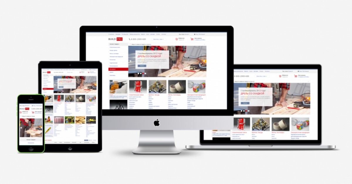
In a world where most people access the internet through their mobile devices, the importance of mobile-friendly websites cannot be overstated. Elementor mobile editing empowers website creators to tailor their sites for optimal mobile user experience. This approach not only boosts user engagement but also contributes significantly to search engine rankings, where mobile-friendliness is a key factor.
Elementor Mobile Optimization: Ensuring Seamless User Experiences
Elementor’s mobile optimization capabilities are a game-changer. They allow designers to create responsive websites that automatically adjust to different screen sizes. This flexibility is vital for providing a seamless user experience, regardless of the device used. Elementor responsive design tools enable you to fine-tune every element, ensuring your website looks perfect on all devices.
Understanding Elementor Breakpoints for Responsive Design
Breakpoints are essential in responsive design, and Elementor breakpoints define where the layout of the website changes to fit different screen sizes. By customizing these breakpoints, you can control how your website appears on various devices, ensuring clarity and ease of use.
Creating an Intuitive Elementor Mobile Menu
Navigation is key to user experience. Elementor mobile menu options allow you to design a mobile-friendly menu that enhances usability. An intuitive, easily accessible mobile menu is critical for keeping your audience engaged and reducing bounce rates on smaller screens.
Elementor Mobile Editing: A Step-by-Step Guide
Elementor’s interface is user-friendly, making mobile editing a breeze. Here, we walk through the essential steps of using Elementor to edit and optimize your website for mobile devices.
• Start with a Template: Choose a responsive template as your starting point.
• Customize Using Elementor: Use Elementor’s drag-and-drop editor to adjust elements for mobile screens.
• Set Elementor Breakpoints: Customize breakpoints to ensure your design adapts to different screen sizes.
• Refine Your Mobile Menu: Design a mobile menu that is easy to navigate.
• Preview and Adjust: Use Elementor’s mobile editing mode to preview and fine-tune your design.
Real-Life Examples of Elementor Mobile Editing
To illustrate the power of Elementor in mobile editing, let’s look at some real-life examples. Consider a local restaurant website. By using Elementor’s mobile optimization tools, the restaurant ensures that its menu, booking form, and contact information are easily navigable on a smartphone. This practical application highlights how Elementor enhances the mobile user experience.
Best Practices for Elementor Responsive Design
To make the most of Elementor’s capabilities, follow these best practices:
• Use flexible grids and layouts.
• Optimize images and media for faster loading on mobile devices.
• Prioritize content and functionality that mobile users need most.
• Regularly test your website on various devices to ensure compatibility.
Conclusion: Embracing the Future with Elementor Mobile Editing
Elementor mobile editing is not just a feature; it’s a necessity in the mobile-first world. By embracing Elementor’s responsive design and mobile optimization tools, website creators can craft experiences that resonate with the mobile audience. This approach is integral to staying competitive and relevant in the digital landscape.