Understanding the Importance of Elementor Tablet Optimization
Elementor tablet optimization is crucial for ensuring that websites built with Elementor perform seamlessly on tablet devices.
In today’s digital landscape, where mobile devices often outpace desktops in internet usage, optimizing for tablets is not just an option; it’s a necessity.
This approach not only enhances user experience but also boosts engagement and conversions, making it a critical aspect of web development.
The Basics of Elementor Responsive Design
Responsive design in Elementor means creating web pages that look great and function well on any device, including tablets.
Elementor responsive design involves using the platform’s powerful tools to adjust screen resolutions and device-specific needs.
Understanding this can help you create more accessible and enjoyable experiences for tablet users.
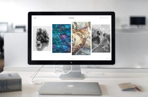
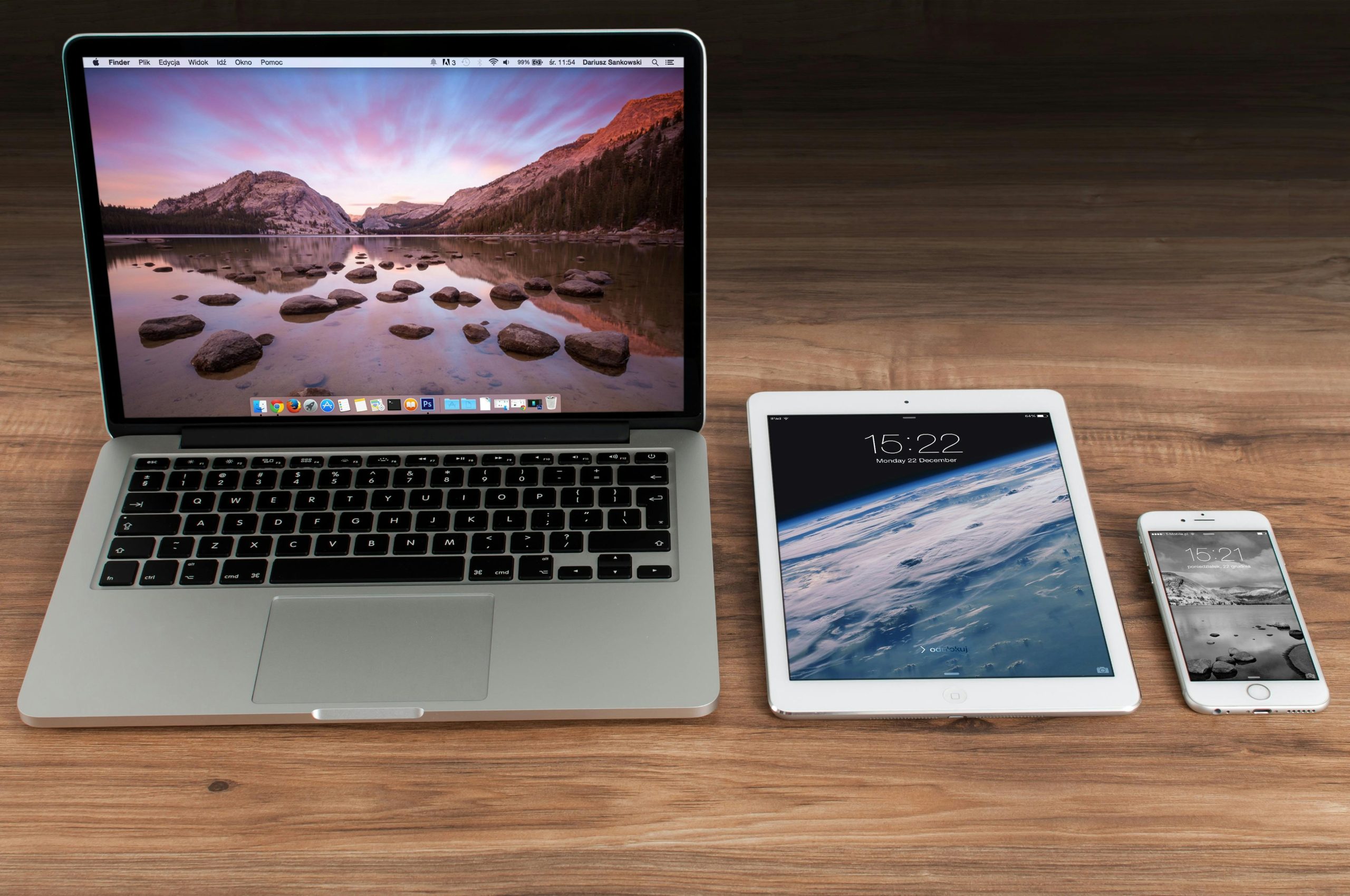
What Makes Tablet Optimization Different?
Tablets have a unique middle ground in screen size, bridging smartphones and desktops.
This makes elementor tablet optimization a bit tricky because you must ensure that the site looks good at this in-between size.
Navigating these challenges requires a strategic approach to design and development.
Incorporating Elementor Mobile Design
Optimizing for mobile is not just about scaling down a desktop site.
Elementor mobile design requires a thoughtful approach where touch interactions, smaller screens, and varying orientations are considered.
This preparation ensures that mobile users receive a user-friendly experience, crucial for keeping engagement high and bounce rates low.
How to Optimize for Mobile and Tablet Using Elementor
To begin, start with the basic principles of Elementor mobile optimization.
Ensure your layouts are fluid, use scalable images, and prioritize important content to display prominently on smaller screens.
This setup is essential for creating responsive websites that cater effectively to both mobile and tablet users.
Advanced Techniques in Elementor Tablet Optimization
Once you grasp the basics, you can employ advanced techniques for Elementor tablet optimization.
Use Elementor’s visibility controls to fine-tune what content appears on different devices.
Adjust padding and margins specifically for tablets to ensure that the design does not feel cramped or overly spaced.
Real-Life Examples of Effective Tablet Optimization
Consider a real-life example: an e-commerce site that has optimized its tablet view using Elementor.
Products are displayed with larger images and simplified navigation that is easy to tap with a finger, significantly enhancing the shopping experience on a tablet.
Such tweaks can dramatically improve usability and customer satisfaction.
The Role of Testing in Elementor Responsive Design
Testing is critical in elementor responsive design.
Regularly test your website on various devices, including different tablet models, to ensure that it displays correctly across all screens.
This practice helps identify any issues early, allowing for timely adjustments and ensuring a consistent user experience.
Best Practices for Ensuring Seamless Tablet User Experience
To achieve the best results in elementor tablet optimization, keep the following practices in mind:
• Use responsive themes from Elementor’s library.
• Employ mobile-first design principles.
• Test interactivity elements like buttons and links to ensure they are easy to use on a tablet.
Conclusion: The Future of Elementor Tablet Optimization
As technology advances and tablet usage continues to grow, the importance of optimizing websites for this format cannot be understated.
Elementor tablet optimization is a dynamic field that will continue to evolve, requiring web designers and developers to stay on top of the latest trends and techniques.
Embracing these changes is essential for anyone looking to succeed in the competitive digital space.
By focusing on these aspects, you ensure that your website is not only functional but also engaging for tablet users, thereby enhancing overall traffic and user interaction rates.